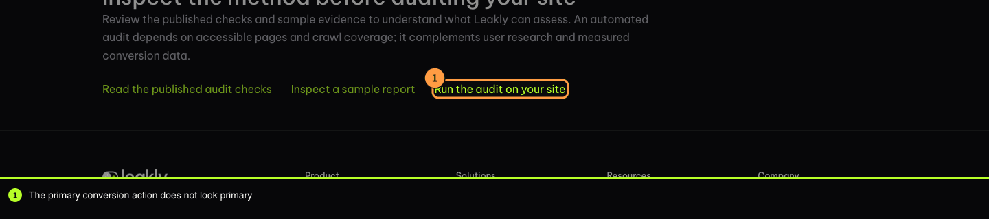
Before asking anyone to trust an audit, we run it on our own site. This is the unedited report Leakly produced for leakly.ai with signup as the goal: the score, the one finding it raised with its annotated capture, and the fix it recommends.
The primary conversion action does not look primary
The main conversion control carries no more visual weight than the actions around it.
Captured from /how-it-works on desktop, 2026-10-26.
Evidence
"Run free audit" carries as much visual weight as the conversion action "Run the audit on your site" (172x50px against 191x20px).
The first screen presents 5 separate actions of comparable weight: "Product", "Solutions", "Resources", "Run free audit", "Open chat".
Why it matters
Visitors scan for the obvious next step rather than reading to find it. When nothing stands out, attention spreads across every option and the conversion path loses it.
Recommended fix
Reduce the visual weight of secondary navigation and alternative actions to establish clear hierarchy for the primary conversion button.
Apply a subtle text style (e.g., muted gray, no border) to 'Product', 'Solutions', and 'Resources' links in the header to distinguish them from the primary action.
Change the 'Open chat' trigger to a small, floating icon or a low-emphasis text link at the bottom right corner.
Ensure the primary 'Run the audit on your site' button uses a high-contrast color and sufficient padding to visually dominate the remaining elements.
Unedited output of Leakly 1.0.1 on Oct 26, 2026. A visual audit finds potential problems from the pages themselves; it cannot prove that a change will lift conversions.
Strictly necessary storage keeps the site secure and remembers this choice. Analytics, ad measurement and the support chat run unless you refuse them here.We use cookies for analytics, ad measurement and the support chat.Cookie policy